技术资讯
web表单按钮的使用
2008-10-31 11:24:00
Article copyright by Gabriel Svennerberg
Gabriel Svennerberg版权所有
原作者:Gabriel Svennerberg;译者:UCD翻译小组,mysmth2003原文网址://www.sve🎶nnerberg.com/2008/09/the-use-of-buttons-in-web-forms/
动作按钮存在于每个web表单的底端。它们太平常了,以至于我们甚至不能仔细思考实际怎么去设计它们。从一堆伟大的易用性思想和我自己的经验中可收集到的信息中,我想提出一套做法来让这种设计更高效些。
Action buttons exists at the bottom of almost every web form. They’re so common that we often doesn’t even reflect on how to actually design them. By gathering information from a few of the great minds in the field of web usability and also from my own experiences, I’ve tried to come up with a set of best practices on how to design them efficiently.
Position 位置
根据Jakob Nielsen(雅各布·尼尔森)的观点,按钮的规则并没有那么麻烦。每个位置都有它的优点和缺点。而重要的一点是一致,如有可能遵照GUI标准平台的规范。
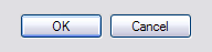
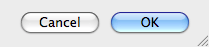
在网络世界以外,也有GUI标准,问题是他们在不同的平台上是不同的。在Windows平台上,GUI规范表明“确认”应该在左侧,而“退出”在右侧。而在苹果平台下,恰恰相反。
According to Jakob Nielsen, the order of the buttons doesn’t matter that much. Both positions has it’s pros and cons. The important thing is to be consistent and if possible follow platform GUI standards [1].
Outside the web world there are GUI standard. The problem is that they are different on different platforms. On the Windows platform the GUI guidelines state that OK should be positioned to the left and Cancel to the right. On the Apple platform it’s the other way around.
在web中,并没有固定的标准要求怎么去做,所以我们必须聪明地找出什么位置是最合适的。
On the Web there really is no standard on how to do this, so we have to try to find out which position is the smartest on our own.
Luke Wroblewski(卢克·罗博乌斯奇)在《网络应用表单设计》一文中专注于这个话题的探索。他建议把首要动作“确定”放置在表单的左侧,次要动作“退出”放置在表单右侧。
他进一步在《网络表单设计》一书中,阐述了从易用性对比测试中的发现:测试表明主要动作在左侧而次级动作在右侧具有更快的绩效。
Luke Wroblewski elaborates on this topic in his article Web Application Form Design [2]. His recommendation is to position the Primary action (OK) aligned to the left part of the form and the Secondary action (Cancel) to the right.
He elaborates even further on this topic in the book Web Form Design [3], where he presents the finding from a usability test performed on a form with different designs. What the test showed is that having the Primary action left-aligned and the Secondary action to the right of it makes for the fastest performance
Robert Hoekman, jr.(罗布特·霍克曼)也思考了不少关于这方面的内容,并且在《设计片段》(Designing the Moment)提出他的想法。
他同意Luke Wrobleski的关于首要动作在表单左侧的观点,这样做的原因在于可以形成一条很好的线,视线可以跟随,推下表格,从而轻松扫描。另一个原因在于如果用户用tab键(键盘左上方的制表符)操控表单,首要动作可以先于次要动作在表格命令下进行。
Robert Hoekman, jr. has also thought a lot about this and presents his thoughts in the book Designing the Moment [4].
He agrees with Luke Wroblewski that the Primary action should be left-aligned with the form. The reason for this is that this forms a nice line for the eye to follow, working it’s way down the form, thereby making it easy to scan. Another reason is that if the user is navigating the form with the tab-key, the Primary action comes before the Secondary action in the tab order.
Labeling the actions 标记动作
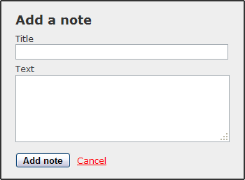
Robert Hoekman, jr. 也有一些关于按钮标记的想法,比恰当标记“确定”和“退出”按钮更好的办法是直接标记实际的动作。如果执行一个“存储一个笔记”(save a note)动作,为什么不让“存储笔记(save a note)”按钮替代“确定”按钮呢?Jakob Nielsen也建议按钮上的文字要说明这个按钮究竟要干嘛,不要只用类似于"确定"这种空泛的文字。 这么做用户会更有自信地使用,因为他知道当他按动按钮的时候将会发生什么。
Robert Hoekman, jr. also have some thoughts about the labeling of buttons. Instead of just labeling the buttons OK and Cancel it’s better to label them after what they actually do [4]. If it’s to save a note, then why not label the OK-button “Save note” instead. Jakob Nielsen also recommends using a label that explains what it does instead of just a generic label [1]. By doing this the user is more confident using the form since he knows what to expect when he pushes that button.
Visual distinction 视觉的差别
另一件事是Robert Hoekman,jr.讨论视觉上区分动作,使得用户能够很轻松地做出正确的选择。
Luke Wroblewski也推断出,做首要的动作要比次要的动作更突出。在易用性测试的调查中,他发现如果首要比次要动作有一点不同的设计的时候,用户会花多一些时间去完成表单。而另一方面,用户会更有信心,较少做出错误的选择。他建议使用不同颜色制作按钮或者让次要动作变成一个普通的链接。
一个简单的方法从视觉上区分两点:我经常去做,则使用粗体(bold font weight),放在首要动作上,而一个正常的字体放在次要动作上。
One other thing Robert Hoekman, jr. discusses is to visually distinguish the actions making it easier for the user to pick the right one.
Luke Wroblewski also concludes that making the Primary action stand out more than the Secondary action is a good thing. In the findings of the usability test, he finds that it takes the user a little more time to complete the form if the Primary and Secondary action has a different design. But on the other hand it makes the user more confident and less prone to choose the wrong one. He suggest making the buttons in different colors or making the Secondary action a plain link.
A simple way to visually distinguish the two that I sometimes do, is to use a bold font weight on the Primary action and a normal font weight on the Secondary.
Robert Hoekman, jr.推荐“对次要动作使用一个普通的链接”,他的理由是说这可以更清楚的判断谁是首要的。但是它也适用于费茨法则,即距离和目标尺寸设多大可被触及并且点击——目标越大会越快些(被触及、点击)。首要动作因此应该比次要动作大一些。
Robert Hoekman, jr. recommends using a plain link for the Secondary action [4]. He’s arguments for this is that it makes it clear which one is the most prominent. But it also applies to Fitt’s Law, which suggest that the distance and the size of a target determines how long it takes to reach it and click it. The bigger the target the faster. The Primary action should therefor be bigger than the Secondary action.
The Reset button 重置按钮
重置按钮被用来重新设置一个完整的表单。这种早期相当常见的应用,到如今却很少被看到。不过我想我也说一些关于这个按钮的话,当它经常被当作成对的按钮出现在表单中的时候。
在多数情况下,这个按钮最好是完全不用。所有经常错误点击重置按钮的用户因此会删掉他们输入的一切内容。(我在Confusing Northface contact form中写过),并且认真地说,你需要多频繁重设整个表单,并且如果你这么做,会产生怎样的问题?
The Reset button is used to reset an entire form. It was pretty common in the early days of the web but is rarely seen nowadays. Nevertheless I thought I would say a few words about this button too since when it appears in a form, it’s usually paired with the Primary action.
In most situations it’s best not to use this button at all. All to often users click the Reset button by mistake thereby deleting everything they’ve entered. (I did it as I wrote in Confusing Northface contact form) And seriously, how often do you want to reset an entire form, and if you do, how hard is it?
这个按钮所具有的风险简单要同可能的收益做一个大的对比,加之在很多情况下,会对表单增加更大的混乱。
正如Jakob Nielsen放到他的警示框专栏《复原和退出按钮》中的话:
网络将会变成更开心的地方,如果所有的重置按钮被虚拟的移走之后。这种按钮几乎不能帮助用户,反而会伤害他们。
The risk with this button is simply to big compared to the possible benefit of it. Plus in most cases it just adds more clutter to the form.
Or as Jakob Nielsen put it in his alertbox column Reset and Cancel Buttons [5]:
The Web would be a happier place if virtually all Reset buttons were removed. This button almost never helps users, but often hurts them.
可能唯一的时间是当重置按钮被请求的时候,是当一个表单被同一个用户重复使用的时候,并且每次输入的信息是不同的。
关于重置按钮Luke Wroblewski有一个想法,他认为如果你提供一个也应该提供一个撤回(undo)选项。用户点击重置按钮重新恢复表单,可以起到撤回的作用。此举意味着你不得不暂时的存储表单数据,但为用户的方便提供了很小的价值。
Possibly the only time when a Reset button is called for, is when a form is used repeatedly by the same user and the information entered differs from each use.
Luke Wroblewski has an idea about the Reset button [3]. He thinks that if you provide one you should also provide an undo for it. By changing the Reset button into an Undo after being clicked the user can restore the form. This means that you have to temporarily store the form data, but that’s a small price to pay for the convenience of the user.
Best practices 最佳方法
基于以上所有的观点,加上我使用并设计web表单的经验,我提出一些好办法。
Taking all of the opinions above in consideration, plus my own experience in using and designing web forms, I’ve come up with these best practices.
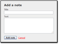
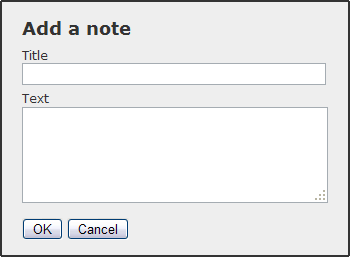
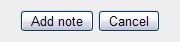
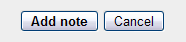
Position the Primary action to the left 首要动作放在左边
把按钮放在表单的左边,可以使得眼睛跟随一条清晰的路线。通过首要动作放在次要动作的左边,也便于tab次序。Having the buttons aligned with the left side of the form makes a clear path for the eye to follow. By putting the Primary action to the left of the Secondary action it’s also positioned first in the tab order.
Label the actions in a natural language 标签动作用自然的语言
通过描述实际动作发生,用户更舒适的感受他期待使用的内容。By describing what the action actually does, the user feels more comfortable using it since he know what to expect.
Make the Primary action stand out 使首要动作凸显
这样可以让用户更轻松选择他们想要的选项,而不会从一堆选项中艰难的发现。This makes it easier for the user to choose the option that’s most likely without making it harder to find the other option.
(Almost) Never use a iReset button (几乎)不要使用重置按钮
重置按钮经常会伤害用户,而不会太多帮助他们。唯一的可能是他们在表单中需要它们,是同一个用户反复再三做不同输入的时候,即一旦你使用了“重置”,也就意味着为用户提供了一个撤回功能。Reset buttons often hurts user more than it helps them. The only time it’s called for is in a form that the same user uses over and over again with different input. If you use a Reset, also try to provide an undo function.
Do you agree with my conclusions or do you have a different opinion about this? Please share!
你同意我的结论或者对此有不同观点,请分享吧!
原文网址://www.svennerberg.com/2008/♍09/the-use-of-buttons-in-web-forms/
关于作者
Gabriel Svennerberg是一位网络开发人员和互动设计师,35岁,自从1996年就从事web的工作。起先自我雇佣,后来在V?xj?、Varberg 和Stockholm等不同的代理商工作,如今为Saab Security构建网络应用以及强化用户体验工作。
//www.svennerberg.com/about/
近期更新
- [2023-07-26 14:17:28] 加拿大预测网-在线预测:为品牌赋能,海外官网品牌数字化
- [2023-05-06 10:32:26] 加拿大预测网-在线预测:青岛网站建设公司,高端网站定制,一站式网站服务&mda🐓sh;—力图数字科技
- [2023-04-27 13:47:54] 加拿大预测网-在线预测:高端定制网站建设——从满足预期到走向卓越
- [2023-04-11 09:17:49] 加拿大预测网-在线预测:H5页面设计开发——移动端传播利器
- [2022-11-16 10:11:43] 加拿大预测网-在线预测:windows2012程序在哪
- [2022-04-14 11:01:47] 加拿大预测网-在线预测:力图数字科技配套网站服务支持
- [2021-05-18 10:14:11] 加拿大预测网-在线预测:青岛网站建设的流程
- [2021-04-29 10:14:38] 加拿大预测网-在线预测:企业定制化官网建设项目
- [2021-03-05 10:34:45] 加拿大预测网-在线预测:移动互联时代房地产行业的微信小程序解决方案
- [2021-01-22 17:29:38] 加拿大预测网-在线预测:微信小程序有哪些优势?为什么要开发微信小程序?
- [2021-01-08 17:28:04] 加拿大预测网-在线预测:网站建设最容易忽略的人性化设计
- [2020-12-16 16:55:32] 加拿大预测网-在线预测:建设一个常规的公司网站建设成本大概是多少?
延伸阅读
- [2008-05-13 14:06:00] 加拿大预测网-在线预测:状态按钮和导向按钮
- [2014-08-31 23:08:11] 加拿大预测网-在线预测:反馈表单的确认后提交提示
- [2008-12-26 09:14:00] 加拿大预测网-在线预测:QQ影新皮肤,不只是大按钮这么简单
- [2008-10-29 17:59:00] 加拿大预测网-在线预测:按钮还是分类,以及好友的组合
- [2015-07-16 21:42:58] 加拿大预测网-在线预测:织梦自定义表单获取到当前时间
- [2012-02-02 11:40:05] 加拿大预测网-在线预测:WEB表单设计分析及重要性
- [2008-10-10 08:32:00] 加拿大预测网-在线预测:登录和注册按钮的三种表现状态
- [2009-03-03 08:51:00] 设计评论表单
- [2009-02-18 10:45:00] 加拿大预测网-在线预测:互联网表单设计—第一章 表单设计(1)
- [2014-11-29 13:24:10] 加拿大预测网-在线预测:网页设计中的按钮小窍门
- [2008-11-12 11:58:00] 加拿大预测网-在线预测:“确定”⛦与“取消”按钮:如何正༺确排序?
- [2008-10-10 08:31:00] 加拿大预测网-在线预测:表格按钮的摆放和命名?
解决方案
加拿大预测网-在线预测: 轮胎行业网站设计解决方案 加拿大预测网-在线预测: 机械行业网站设计解决方案 加拿大预测网-在线预测: 房地产行业网站设计解决方案 加拿大预测网-在线预测: 科技企业网站设计解决方案 加拿大预测网-在线预测: 电子家电网站设计解决方案 加拿大预测网-在线预测: 食品行业网站设计解决方案 加拿大预测网-在线预测: 集团公司网站设计解决方案 加拿大预测网-在线预测: 企事业单位网站设计解决方案 加拿大预测网-在线预测: 外贸行业网站设计解决方案 加拿大预测网-在线预测: 健身运动网站设计解决方案 加拿大预测网-在线预测: 美容与化妆品网站设计解决方案 加拿大预测网-在线预测: 建筑设计行业网站设计解决方案 加拿大预测网-在线预测: 物流行业网站设计解决方案
TAGS关键字
GOOGLE 官网建设 加拿大预测网-在线预测:青岛网站建设基础知识 加拿大预测网-在线预测:青岛不错的英文网站建设公司 加拿大预测网-在线预测:青岛开发区建站公司 青岛网络公司 青岛网站案例 加拿大预测网-在线预测:网站建设的步骤有哪些 网站设计趋势 网站制作 页面设计 加拿大预测网-在线预测:青岛黄岛、红岛网站建设公司 高端网站设计 集团公司网站建设 网站的速度 营销策略 青岛做网站多少钱 企业网站建设 青岛轮胎网站设计 H5 力图 集团官网 加拿大预测网-在线预测:青岛好的网站优化公司 网站品牌 如何做网站优化 网站推广 php程序 青岛海洋投资集团 网页设计 加拿大预测网-在线预测:青岛轮胎网站设计公司